David Donihue
Senior UX/UI Designer
David Donihue
About Me
Senior UX/UI Designer
About Me


For more than 20 years, I’ve worked on the end-to-end design and development of enterprise applications used by more than 60,000 people who provide healthcare management, art inventory management, call center operations, sales, and support to millions of customers.
I enjoy working with teams that build products through creative collaboration with an awareness of how they impact our quality of life.
In addition to my UX work, I do carpentry, collect old political cartoons, cultivate a rooftop garden, and spend time with my family in New York City.
I believe that the best products are built through creative collaboration and an awareness of how they impact our quality of life.
In addition to my UX work, I do carpentry, conduct digital privacy workshops, collect old political cartoons, cultivate a rooftop garden, and spend time with my family in New York City.
Where I've Worked
Healthfirst:
Senior UX/UI Designer
New York, NY | 2020 to Present
Healthfirst is one of the nation’s largest not-for-profit health insurers. They work with care providers and community leaders to improve health outcomes, especially in underserved communities.
Working with five teams, I developed over 350 clickthrough prototypes for:
• The launch and development of a care management dashboard used by multiple teams to review and analyze the personal, medical, and coverage information of 1.7 million Healthfirst members.
• Data visualization of patient lab tests and remote device monitoring.
• A healthcare provider collaboration platform designed to integrate with EHR systems to support med adherence and close diagnosis gaps.
• The redesign of a quality incentive program dashboard that tracks performance and earnings of healthcare providers.
• The redesign of a risk adjustment portal for healthcare claims.
• User Administration and KPI dashboards.
ArtBinder:
UX/UI Designer
New York, NY | Jun 2022 to Oct 2023
ArtBinder is a leading inventory management and sales application for the art market.
In 2020 I was hired to provide UX/UI consulting services until the COVID pandemic forced them to abruptly downsize. I was rehired in June 2022.
2019 to 2020
At the end of 2018, I accepted a buyout offer that allowed me to take time off. During this time I traveled, developed two WordPress sites, studied UX design, and conducted Digital Privacy Workshops for Consumer Reports.
Verizon Communications:
Senior UX Designer
New York, NY | 2004 to 2018
I was UX research and design lead on:
- A lead list and sales management mobile application used by Verizon’s door-to-door sales agents across the country.
- A data analytics application used by managers to guide business decisions and assign sales leads.
- A workforce management application used by Verizon’s business partners to perform market analysis, assign leads, track sales, and monitor the agents’ performance.
- A customer service application used by over 60,000 call center agents across the country to order and modify services, analyze billing and payment histories, resolve disputes, manage payments, and more.
I received Verizon Spotlight Awards for this work in 2017 and 2018.
Verizon Communications:
UX/UI Designer
New York, NY | 2000 to 2004
When Verizon’s Technology Organization retructured, I was responsible for consolidating ten departmental intranet sites into a single portal.
For this project, I collected requirements, created design standards, designed the UX and UI, built prototypes, and performed testing.
I also designed and built a project management site to facilitate communication between the teams.
When one of Verizon’s business customers needed a customer care internet portal, I collected requirements and developed the UX and UI.
Bell Atlantic:
UX/UI Lead & Technical Writer
New York, NY | 1997 to 2000
I collected requirements and developed the UX and UI for five departmental intranet sites with ISO9000-compliant departmental procedures and a customer contract management system.
I received the Bell Atlantic Leaders in Excellence Award for these sites.
NYNEX Science & Technology:
Requirements Team Lead
White Plains, NY | 1992 to 1997
As part of an effort to define market opportunities for broadband networks, I interviewed doctors and wrote a telemedicine research study on Stony Brook Health Sciences Center’s radiology department.
Additional studies were done for distance education networks in New York, New Hampshire, and Vermont.
Alternative Ctr for International Arts & Others:
Curator & Grant Writer
New York, NY | 1983 to 1992
I curated 17 art and technology exhibitions and installed 54 exhibits featuring the work of 422 artists.
Other employers included the Whitney Museum of American Art, the International Center of Photography, New York City Dept. of Cultural Affairs, the Rockefeller Foundation, Parabola Arts Foundation, and other non-profit arts organizations.
Selected Projects

Sales Agent – Bronx, NY
Project 1
Door-to-Door Sales
Mobile & Desktop Applications

Sales Agent – Queens, NY
Duration of project: 2 years
Team size: 40 – 50 people across the U.S. and overseas
When Verizon undertook a digital transformation of its door-to-door sales process, I was the UX design lead for a tablet application used to sell Fios services. This application replaced the spreadsheets and hand-written notes that sales agents had previously used to manage the process.
I also led the UX design of additional desktop applications that helped supervisors create lead lists, assign leads and monitor the performance of their teams.
I worked on the end-to-end development of these applications, collaborating with business and development teams in New York, New Jersey, Texas, and India.
When Verizon undertook a digital transformation of its door-to-door sales process, I was the UX design lead for a tablet application used to sell Fios services. This application replaced the spreadsheets and hand-written notes that sales agents had previously used to manage the process.
I also led the UX design of desktop applications …
… that helped supervisors create lead lists, assign leads and monitor the performance of their teams.
I worked on the end-to-end development of these applications, collaborating with business and development teams in New York, New Jersey, Texas, and India.
My Role
While my primary role was UX design, I worked on additional tasks as needed.
My responsibilities included:
- Stakeholder discussions
- Field visits and observation
- User-centered research
- Task analysis
- Data analysis
- Security analysis
- Network and device analysis
- Data visualization
- GPS tracking analysis
- Process diagrams, information architecture, and screen flows
- Client reviews
- Development discussions
- Wireframes
- Clickthrough prototypes
- Design presentations
- Testing and design validation
- End user training
- launch support for end users
- End user feedback
UX Challenges
The business partners had multiple existing systems
The systems were often developed at considerable expense. The new lead list management applications needed to match and eventually surpass their existing capabilities.
The sales agents worked on a commission-only basis
They didn’t want to dedicate time to training or entering data if it meant they would have less time for making sales. The new door-to-door sales application needed to offer faster methods of planning their routes and documenting the outcomes.
Managers needed to see status updates on their agents’ progress
They wanted to know how many customers were visited and the outcomes of the visits so they could identify coaching opportunities.
UX Process
Discovery and requirements development
- I interviewed and shadowed sales agents in New Jersey, Manhattan, and Queens to learn how they worked.
- I met with supervisors to learn how teams were managed and trained.
- I reviewed the findings and led UX requirements analysis and design reviews with Verizon’s business, marketing, legal, and development teams.
Deliverables
- Process flow, information architecture, and screen flow diagrams were created with OmniGraffle and Sketch.
- High fidelity wireframes were created with Sketch, Illustrator, and Photoshop.
- Clickthrough prototypes were created with Craft and InVision.
- Documentation was delivered and ongoing support was provided to front-end and backend development teams.
Testing, training, launch support and field visits
- Once coding was completed, I performed tablet and desktop testing and created UI audits for developers.
- I provided on-site training and launch support for sales agents in the field.
- Field visits collected feedback for future enhancements.
End Results
Three desktop applications were developed for managers to create and maintain lead lists
- Verizon administrators used a desktop application to assign millions of leads to their direct-sales business partners.
- Business partner administrators used a second desktop application to assign the leads to their door-to-door agents.
- Agent supervisors used a third application to review their agents’ performance and identify coaching opportunities.
A mobile application was developed for door-to-door sales agents
- This application was used to make residential and business sales to customers in the New England and mid-Atlantic states.
These applications were used in Verizon’s first 5G pilots
- When Verizon launched its first 5G pilots in Houston, Indianapolis, Sacramento, and Los Angeles, these applications were used to sell the new service.
Work Samples
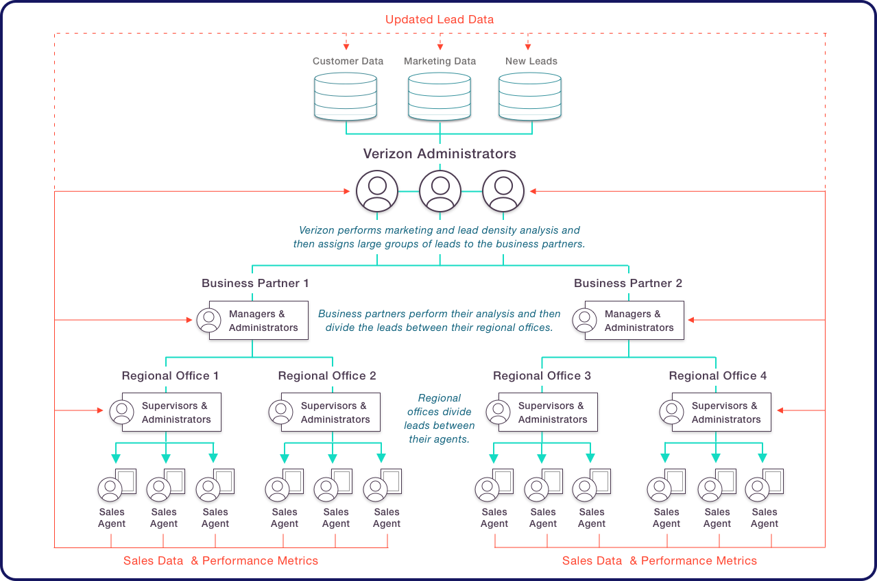
I created this diagram to illustrate the roles of the people using the applications and the flow of information:
1. Administrators analyzed millions of sales leads and assigned them to their Business Partners.
2. The Business Partners assigned the leads to their Regional Offices.
3. The Regional Offices assigned the leads to their Sales Agents.
4. Sales and performance metrics were captured to help improve
the process.
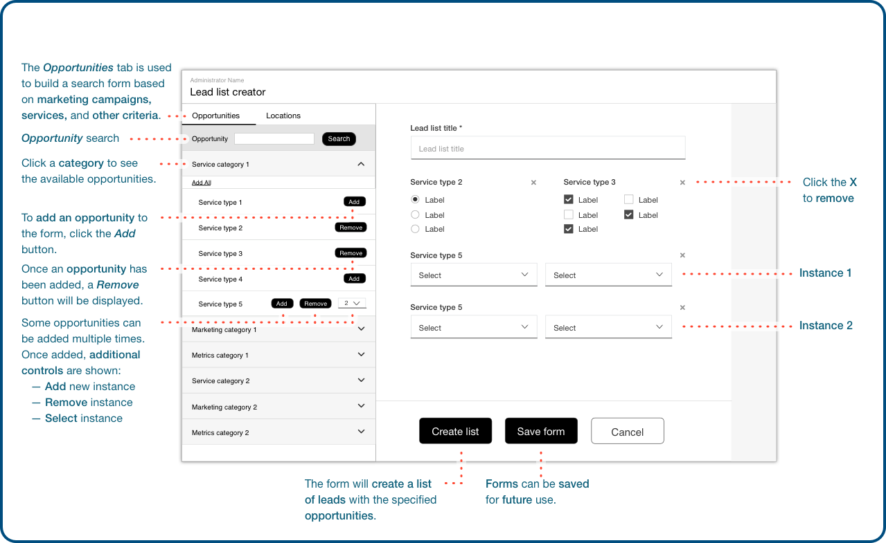
Lead List Creator - Form Builder
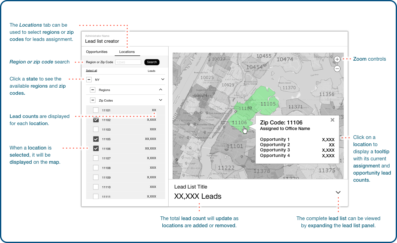
This application was built to create custom lead lists.
I designed a form builder as the first step of the process. It supported data analysis by filtering the leads and mapping marketing opportunities to locations where sales agents were authorized to sell.
Lead List Creator - Mapping Feature
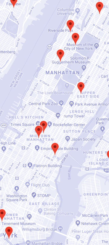
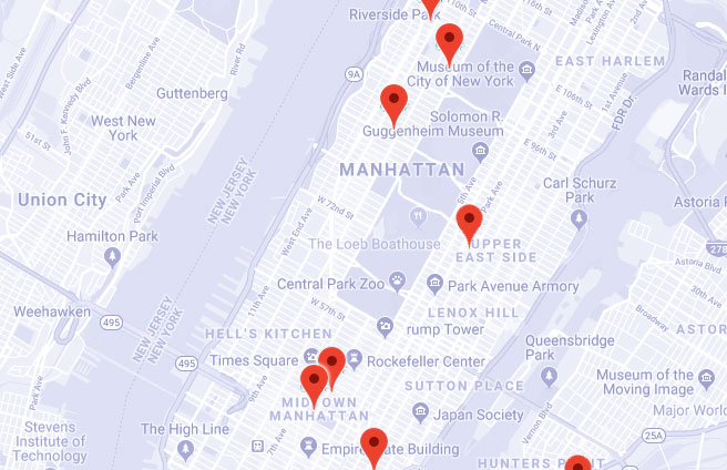
Once the form filtered the marketing opportunities, users could view the number of leads that were available in specific locations.
Locations with a high density of leads were assigned to the business partners for further analysis or directly to the sales agents.

Once a lead list was assigned, it was downloaded to a mobile app used by door-to-door sales agents.
One of the research findings was that the agents’ income was based solely on sales commissions. They were reluctant to spend time training or reading documentation because it took time away from making sales. This heightened the need for a design that was as simple as possible.

I created this diagram to illustrate the roles of the people using the applications and the flow of information:
1. Administrators analyzed millions of sales leads and assigned them to their Business Partners.
2. The Business Partners assigned the leads to their Regional Offices.
3. The Regional Offices assigned the leads to their Sales Agents.
4. Sales and performance metrics were captured to help improve
the process.

Lead List Creator - Form Builder
This application was built to create custom lead lists.
I designed a form builder as the first step of the process. It supported data analysis by filtering the leads and mapping marketing opportunities to locations where sales agents were authorized to sell.

Lead List Creator - Mapping Feature
Once the form filtered the marketing opportunities, users could view the number of leads that were available in specific locations.
Locations with a high density of leads were assigned to the business partners for further analysis or directly to the sales agents.
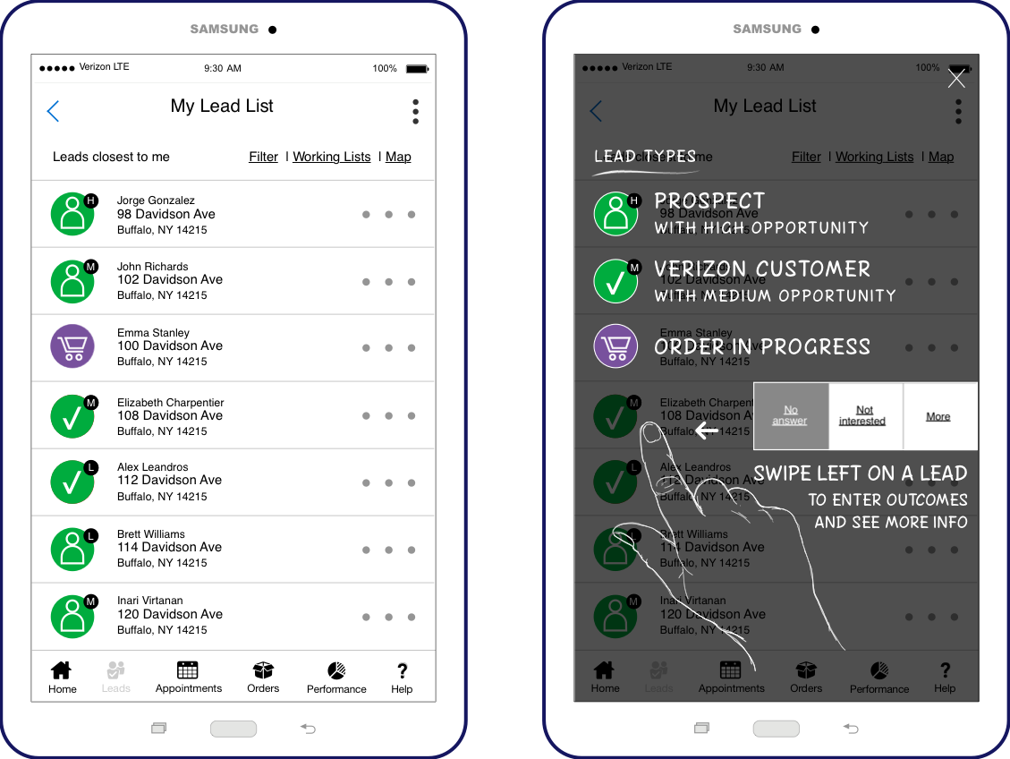
Once a lead list was assigned, it was downloaded to a mobile app used by door-to-door sales agents.
One of the research findings was that the agents’ income was based solely on sales commissions. They were reluctant to spend time training or reading documentation because it took time away from making sales. This heightened the need for a design that was as simple as possible.

Call Center
Project 2
Bills & Payments
Call Center Applications

Call Center
Duration of project: 10 years (on and off)
Team size: Over 100 people across the U.S. and overseas
Verizon’s call center representatives use a software application to help millions of customers resolve billing issues, and order new services.
Reps and financial teams review customer bills and payment histories, investigate and resolve billing disputes, set up one-time or automatic payments, and estimate a customer’s future charges.
I worked as UX Lead on the billing features and as one of the UX designers on the ordering features. I worked with business and development teams based in Florida, Maryland, Massachusetts, Pennsylvania, Texas, and India.
My responsibilities included UX designs, UX writing, development documentation, and training materials.
My Role
While my primary role was UX design, I worked on additional tasks as needed.
My responsibilities included:
- Stakeholder discussions
- User-centered research conducted in Verizon’s call centers
- Task anaylsis
- Data analysis
- Process diagrams, information architecture, and screen flows
- Client reviews
- Development discussions
- Design presentations
- Wireframes and clickthrough prototypes
- Data visualization
- Design presentations
- Working with onshore and offshore development teams
- Testing and design validation
- On-site training and launch support for end users
- End-user feedback
UX Challenges
Legacy systems constrained design and development.
The
application was built on mutiple billing systems designed by different companies to meet legal requirements in different parts of the country. Some of the states in Verizon’s service area (New York, New England, Texas, Florida, Pennsylvania, New Jersey, Virginia, Delaware, and Washington DC) had different billing procedures based on state regulatory and tax requirements.
Industry-specific terminology and abbreviations required translation and standardization.
The customer care agents had a wide range of knowledge and experience levels. There was a constant debate about designing for the knowledge level of existing users vs. untrained future users.
UX changes sometimes required cultural changes.
Business, marketing, and IT teams sometimes needed education and persuasion to initiate UX changes. Groups with long-standing business processes would sometimes resist new approaches.
UX Process
Discovery and requirements development:
- I visited call centers in New Jersey, Manhattan, Brooklyn, Queens, Long Island and other locations to interview customer care agents and listen to their conversations with customers.
- I led UX requirements analysis and design reviews with Verizon’s business, marketing, legal, executive, and development teams.
- I led focus group design reviews in the call centers.
- I conducted interviews with customer care reps during call center visits.
- I participated in side-by-side customer call listening sessions in the call centers.
- I reviewed and analyzed customer call recordings.
- I worked as a customer care rep, taking calls directly from customers and using the application to make sales and resolve billing issues.
- I reviewed findings with clients and development teams.
- I met with supervisors to learn how to improve the system and meet their sales targets.
- I led reviews with individuals and groups to analyze requirements, review designs, and collect feedback.
Deliverables:
- Process flow, information architecture, and screen flow diagrams were created with Illustrator and Sketch.
- High fidelity wireframes were created with Sketch, Illustrator, and Photoshop.
- Clickthrough prototypes were created with Craft and InVision.
- Documentation was delivered and ongoing support was provided to front-end and backend development teams in the U.S. and India.
Testing, training, launch support, and field visits:
- Once coding was completed, I performed desktop testing and created UI audits for developers.
- I provided on-site training and launch support for agents in the call centers.
- I conducted field visits to collect feedback for future enhancements.
End Results
The application was used by over 60,000 call center agents across the country
- Up to $1,000,000,000 a month in sales were processed through the application.
- Millions of dollars were saved through features that optimized work processes.
- Customer relationships were strengthened by providing agents with tools that could resolve disputes and correct billing problems.
Work Samples

Billing and Payments Dashboard
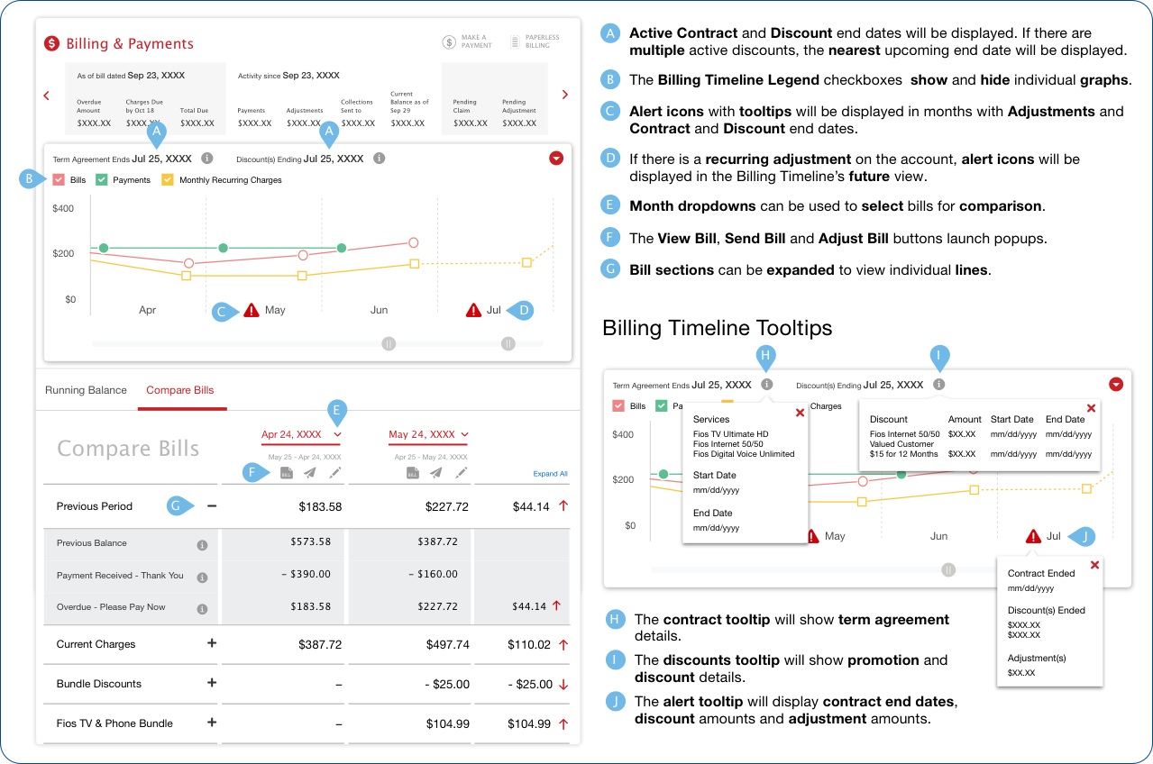
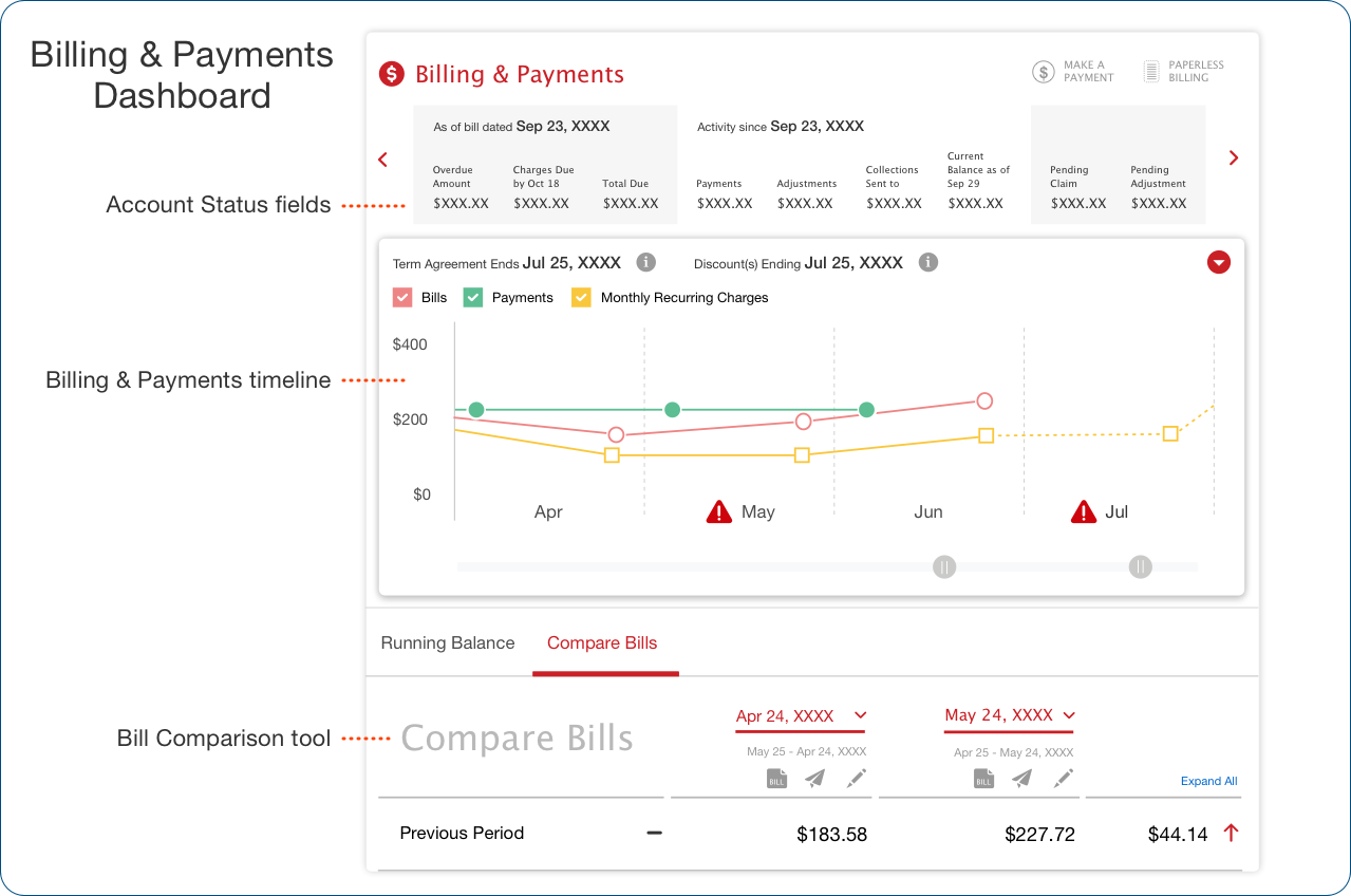
I designed this landing page to give the agents a snapshot of the account’s status along with a timeline that graphed the billing and payment histories.
Agents also had the ability to do line-by-line comparisons of the customer’s bills to review increases and decreases.
For this and other designs, I worked with the agents and their managers to learn their challenges and how the application could best support their work.
Billing and Payments Dashboard User Guide
This guide describes information displayed on the dashboard and the billing timeline functions.
Descriptions are also provided for controls that modify the display, alert icons, tooltips, and other elements of the screen.
An expanded view of the bill comparison tool is also shown.
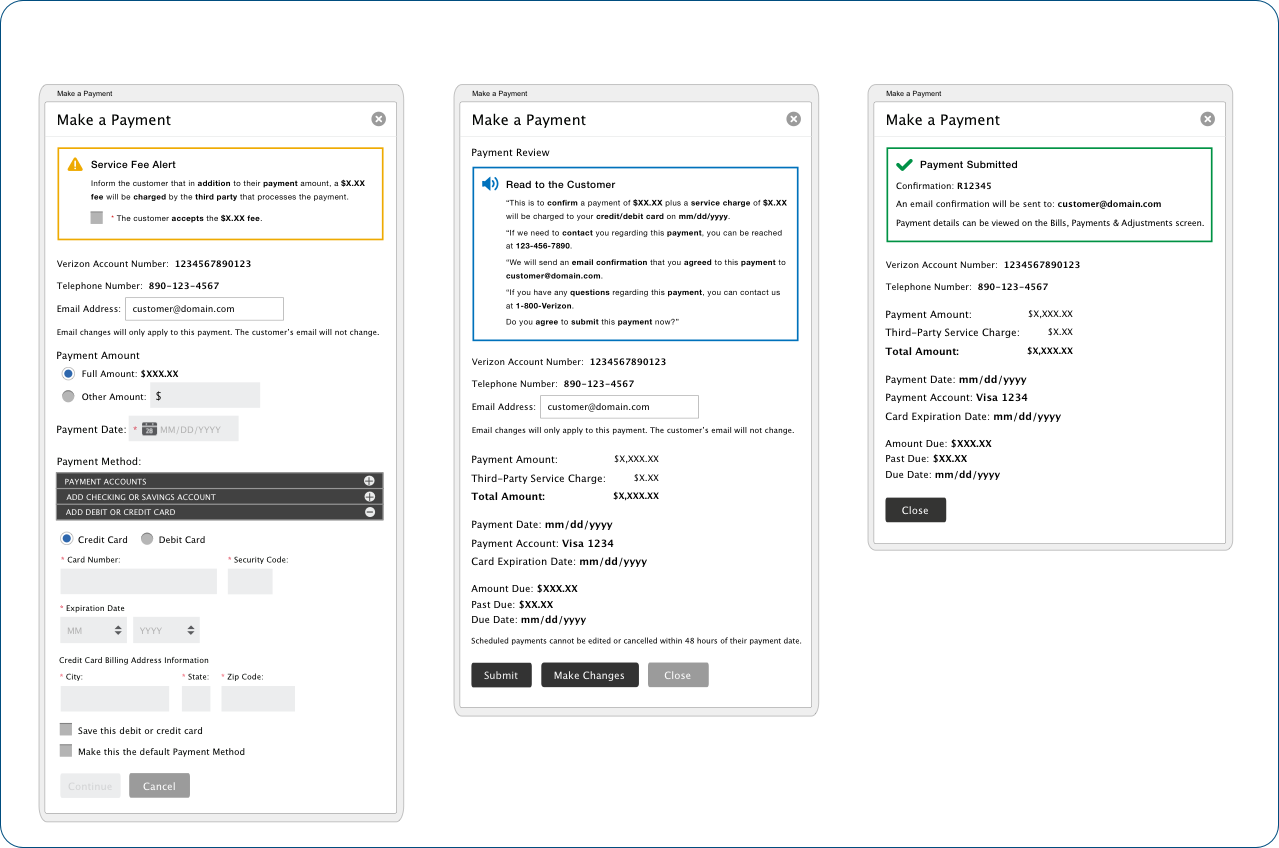
Verizon’s call center agents accepted customer payments over the phone using a popup payment wizard.
In collaboration with subject matter experts on the financial, marketing, legal and development teams, I designed and wrote:
- Service fee messages
- Payment information forms
- Payment and contact information review
- Payment confirmation
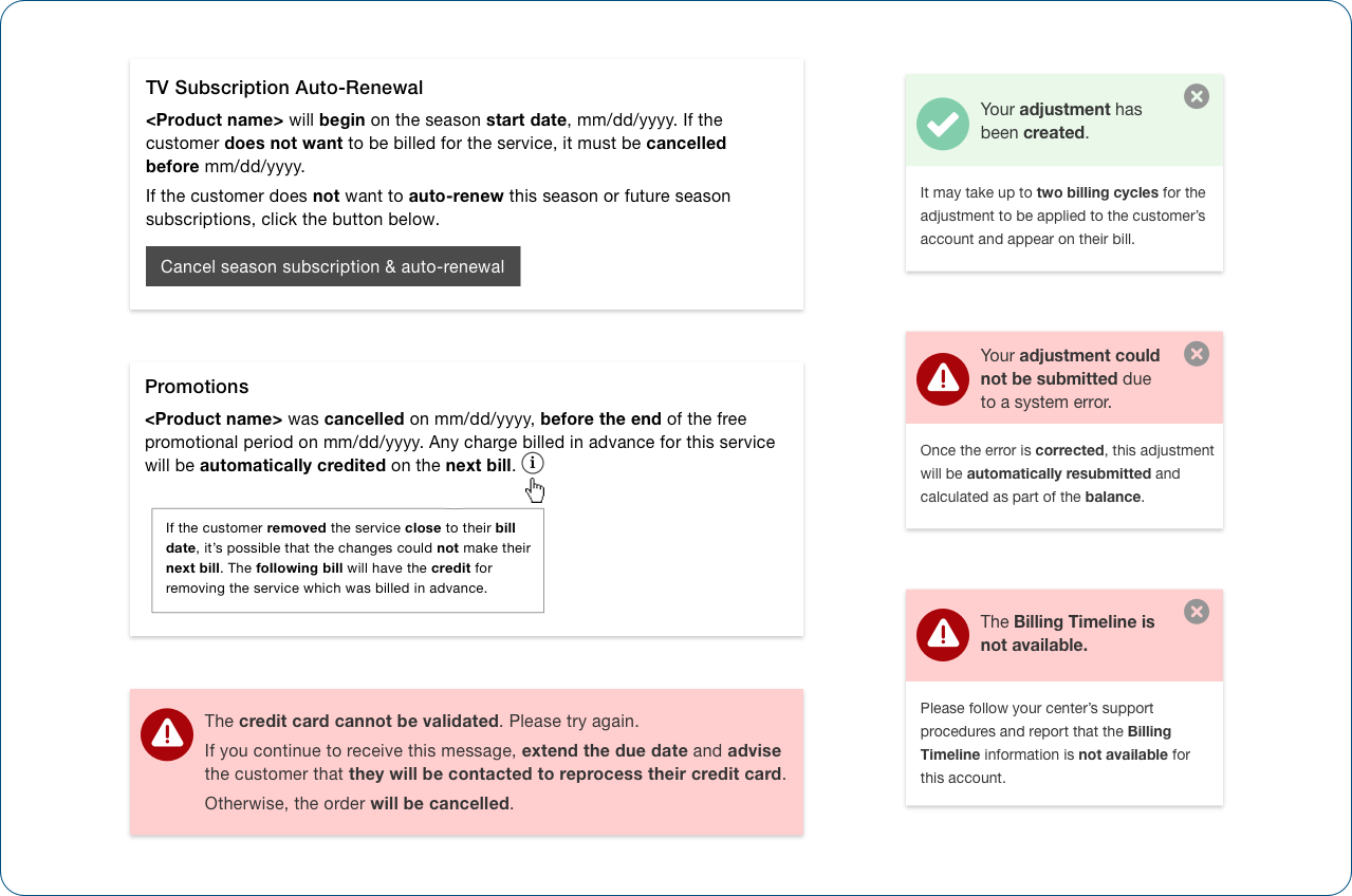
Since the agents were working with large amounts of information, often while speaking with frustrated customers, I wrote messages to be as brief and informative as possible.
Error messages stated the problem, followed by a next course of action. Whenever possible, messages were written so that they could be reused for other scenarios.
A teammate described me as “the go-to person for simple language, with a knack for finding the simplest word to convey the desired meaning.”
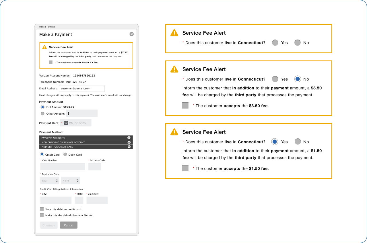
This workforce application was built on the legacy billing systems of the various companies that merged to form Verizon. Sometimes problems arose that required workaround messages.
In this case, if the system could not return a customer’s complete address, the message asked the sales agent to designate whether the customer lived in a state which charged a lower service fee for online payments.
Billing and Payments Dashboard
I designed this landing page to give the agents a snapshot of the account’s status along with a timeline that graphed the billing and payment histories.
Agents also had the ability to do line-by-line comparisons of the customer’s bills to review increases and decreases.
For this and other designs, I worked with the agents and their managers to learn their challenges and how the application could best support their work.

Billing and Payments Dashboard User Guide
This guide describes information displayed on the dashboard and the billing timeline functions.
Descriptions are also provided for display controls, alert icons, tooltips, and other elements of the screen.
An expanded view of the bill comparison tool is also shown.

Verizon’s call center agents accepted customer payments over the phone using a popup payment wizard.
In collaboration with subject matter experts on the financial, marketing, legal and development teams, I designed and wrote:
- Service fee messages
- Payment information forms
- Payment and contact information review
- Payment confirmation

Since the agents were working with large amounts of information, often while speaking with frustrated customers, I wrote messages to be as brief and informative as possible.
Error messages stated the problem, followed by a next course of action. Whenever possible, messages were written so that they could be reused for other scenarios.
A teammate described me as “the go-to person for simple language, with a knack for finding the simplest word to convey the desired meaning.”

This workforce application was built on the legacy billing systems of the various companies that merged to form Verizon. Sometimes problems arose that required workaround messages.
In this case, if the system could not return a customer’s complete address, the message asked the sales agent to designate whether the customer lived in a state which charged a lower service fee for online payments.
These are not the actual designs created for the desktop and tablet applications. To comply with my non-disclosure agreement, some information has been removed, and design elements have been changed.
These are not the actual designs created for the desktop and tablet applications. To comply with my non-disclosure agreement, some information has been removed and design elements have been changed.